Skip to content

“Easy” Excel Inverse Triangular Distribution for Monte Carlo Simulations Redux

Image source: FinancialFoghorn.com

Back in the dark ages when access to computers was not all that common, I was faced with developing a project schedule for, to me, a complex construction project. I was not that long out of school, so I sought out my boss with the hope he would give me some guidance on how to approach the problem.

He told me to use three-point estimation and to talk to some of the older engineers in the firm to get their ideas on the likely outcomes. So, I did and learned that the three points he was talking about were the worst case, the best case, and the most likely case for what would happen during the project. (Wikipedia, n.d.)

He also directed me to consider using PERT. I did and learned that form of project management scheduling including consideration of the optimistic time estimate (o), the most likely or normal time estimate (m), and the pessimistic time estimate (p). In PERT, instead of using probabilities for each estimate of the time required, the task time is calculated as (o + 4m + p) ÷ 6. (Taylor Jr., 2011)

To model a three-point estimate with a probability distribution you need to use a triangular distribution. Today, three-point estimates are commonly used in business and engineering, so it is somewhat surprising that Excel does not have a built-in function to help. I was recently faced with this dilemma in my quantitative methods course which I am trying to migrate away from expensive software solutions.

“Easy” Excel Inverse Triangular Distribution for Monte Carlo Simulations Redux

Flipped!

This headline popped up in my newsfeed this morning: Boys will be boys: Data error prompts U-turn on study of sex differences in school (Retraction Watch, 2017) The article is about a peer-reviewed article on… Flipped!

What to do about outliers?

The most recent assignment in my BUS 430 class was on simple linear regression. In some of the data sets, there are data points that seem to be inconsistent with the bulk of the data. One student called this to my attention and asked if he should just ignore those data points because they were “obviously a mistake.” His comment reminded me that in an earlier assignment, we had discussed briefly using a box plot software tool to identify outliers, but we had not discussed what to do about them.

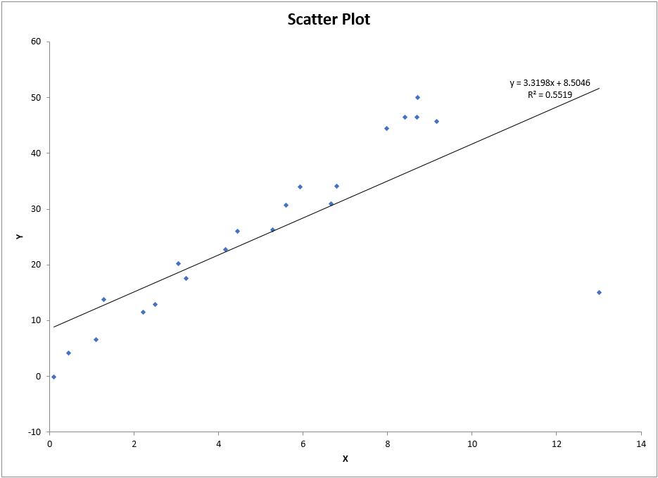
When dealing with just two variables, it is quick and easy to make a scatter plot and inspect it for data points that do not follow the trend of the rest of the data. In the scatter plot below, we can see just such a data point in the lower right.

But using a box plot does not identify this point as an outlier in either the x or y axis:What to do about outliers?